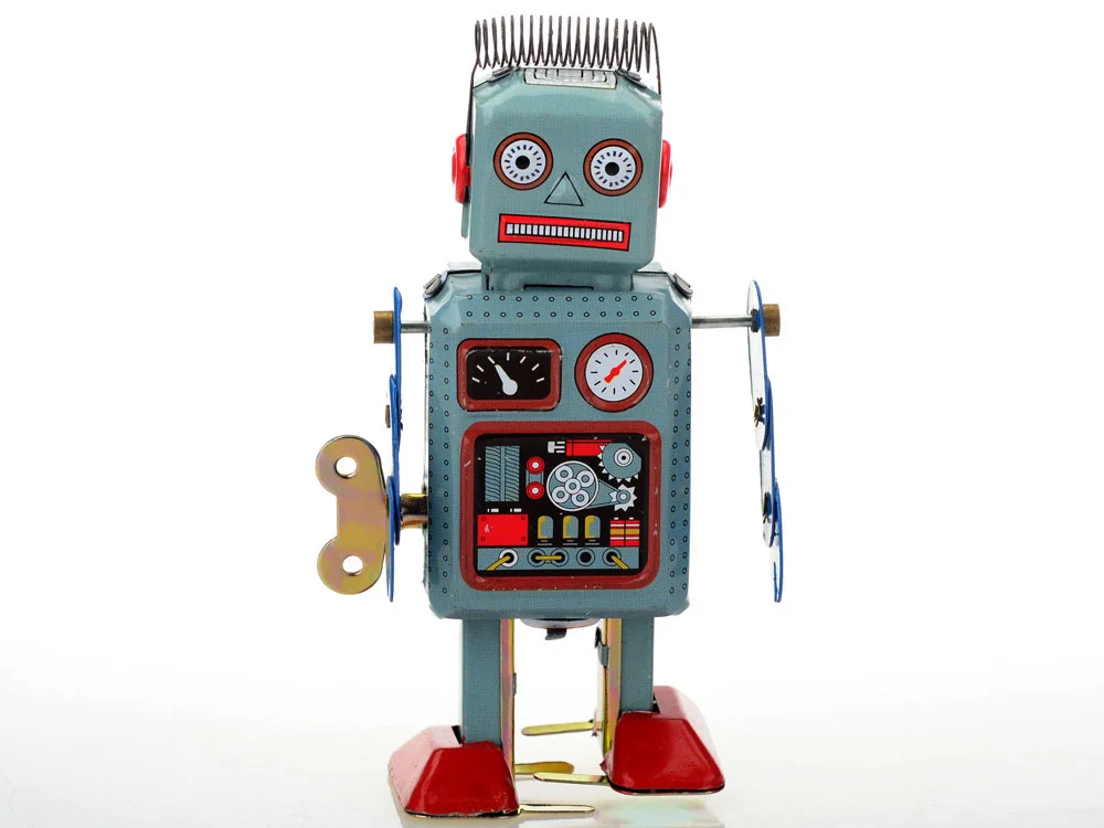
OVERVIEW
Our client, the hypothetical Magic Toy Shop, was seeking to create an ecommerce site to access a broader client base. We were provided with the company brief, including a description of the brand identity, core purpose, values and personality. We also received 3 personas representative of their focus client base. These were John: a younger, tech-savvy father with a young daughter; Jasmine: an older grandma of a 9-year old; and Dexter: a late-20’s man into retro/cool/kitschy toys.
CHALLENGES
- Locate and conduct user research relative to company clients
- Develop a fleshed out site from full-analysis to balance the needs of stakeholders with customer's preferences
- quickly learn and implement new tools
- 2 week duration.
MY ROLE
I designed and delivered wireframes, sitemap, user flows, checkout forms and a prototype for the e-commerce site.

a little inspiration...
Sizing up the competition
RetroPlanet.com
eToys.com
TimewarpToys.com
TinToyArcade.com
My representative users

"If I'm spending money, I want to know what I'm buying."

"I'd like to get her toys that teach her a skill-set"

"I want to see the toys in person."
Design process elements

Card Sorting with Post-It's
rough wireframe sketches
organizing site map and navigation hierarchies
sketching together a site map
Final wireframes created
some final wires: landing page
some final wires: pick 'party starters'
some final wires: quick pop-up
some final wires: 'added to cart'
some final wires: checkout, step 1
some final wires: checkout, step 2
some final wires: checkout, step 3
some final wires: checkout, step 4
some final wires: thank you options
Beginning with the personas as my guides, I started by reaching out to people whom I thought were good living examples. While lining these up, I also dove into comparative/competitive analyses. I stacked up the websites of boutique and retro-focused toy companies alongside the big, established organizations.
I started comparing competitive sites heuristically, according to each personas declared wants/interests on a scale of 1-5.
- e-Toys.com - 40
- TimewarpToys.com - 48
- RetroPlanet.com- 75
- ToysRus.com - 80
- TinToyArcade.com - 90
I then applied the analysis to the sites' navigation:
- TimewarpToys.com - 30
- eToys.com - 48
- TinToyArcade.com - 50
- ToysRus.com - 54
I was able to use these quantitative measurements to better hone in on the most successful elements.
After comparing and contrasting the key benefits and detractors of these sites qualitatively, I began interviews. I spoke with some friends who best represented the spectrum of personas. I was very surprised to find that almost all preferred brick-and-mortar stores like Target, accepting the online megamarket, Amazon.
I also began developing the Magic Toy Shop site map using card sorting. After many iterations, focused around the user's needs, a balanced site-navigation began to emerge.
With that in place, I jumped into sketching and creating wireframes in Omnigraffle. I wanted to be sure to anchor my decisions in the expressed pain points and needs of the personas as much as possible. So with this firmly in mind, and playing off the invaluable insights and inspirations I’d gathered via interviews, I developed the look and feel of the wireframes. I wanted the site to offer a balance of appeal to both kids and adults, while offering an effortless ease of use, dependability, sociability and loyalty to it’s clients.
I kept all this in mind as I developed the structure and user flows. All the categories, buttons, search options, and checkout process were designed to be as easy, seamless and as enjoyable as possible.
TAKEAWAYS:
My big 'ah-ha's:
- implementing a 'Quick Toy Finder' made for enjoyable interaction
- a seamless and painless checkout flow is crucial
- making time to properly sort information architecture is primary
- always be prepared to be surprised by users
If I had more time, I would:
- I'd love to spent more time effectively sorting the navigation options and page placement. Users I spoke to seemed to find the placement of the 2 main menu bars confusing.
- Upon refinement I would switch the placement of the two main bars, so that the ’Age/Category/Brand/Characters/Deals’ bar was nested under ‘Refine Your Results’, and the drop down menu on the left would go in it’s place at the top. I think this would create a more fluid hierarchically.
- I also would remove the navbar on the checkout page, as it seems unnecessarily distracting.
- Finally, I now really understand importance of prioritizing one persona over others, as it can help to avoid scope-creep, and the threat of 'featuritis'.