
OVERVIEW
Worked with a partner to research, develop and create requisite personas, service blueprint, wireframes, and user flows for the manager-facing side of a new POS (Point of Service) app.
CHALLENGES
3-week time frame
Needed to create a robust app that would speak to a minimum 80% of owner/manager needs
Worked within an incredibly saturated market
MY ROLE
Competitive analysis, user interviews, and testing, contextual inquiry, affinity diagrams, persona development, user flows, service blueprint, sketches, wireframes, user interface design, and final client presentation.
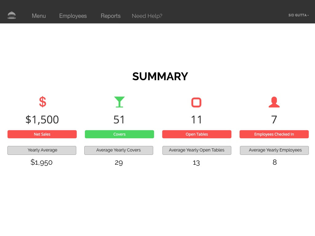
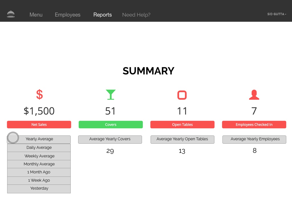
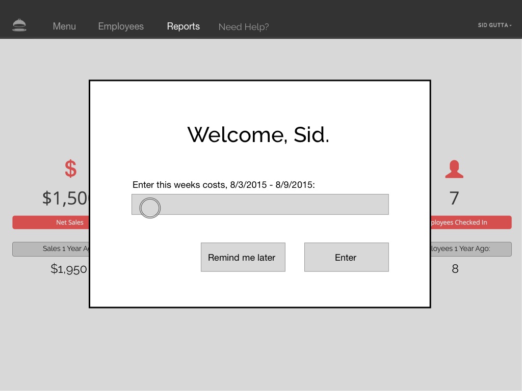
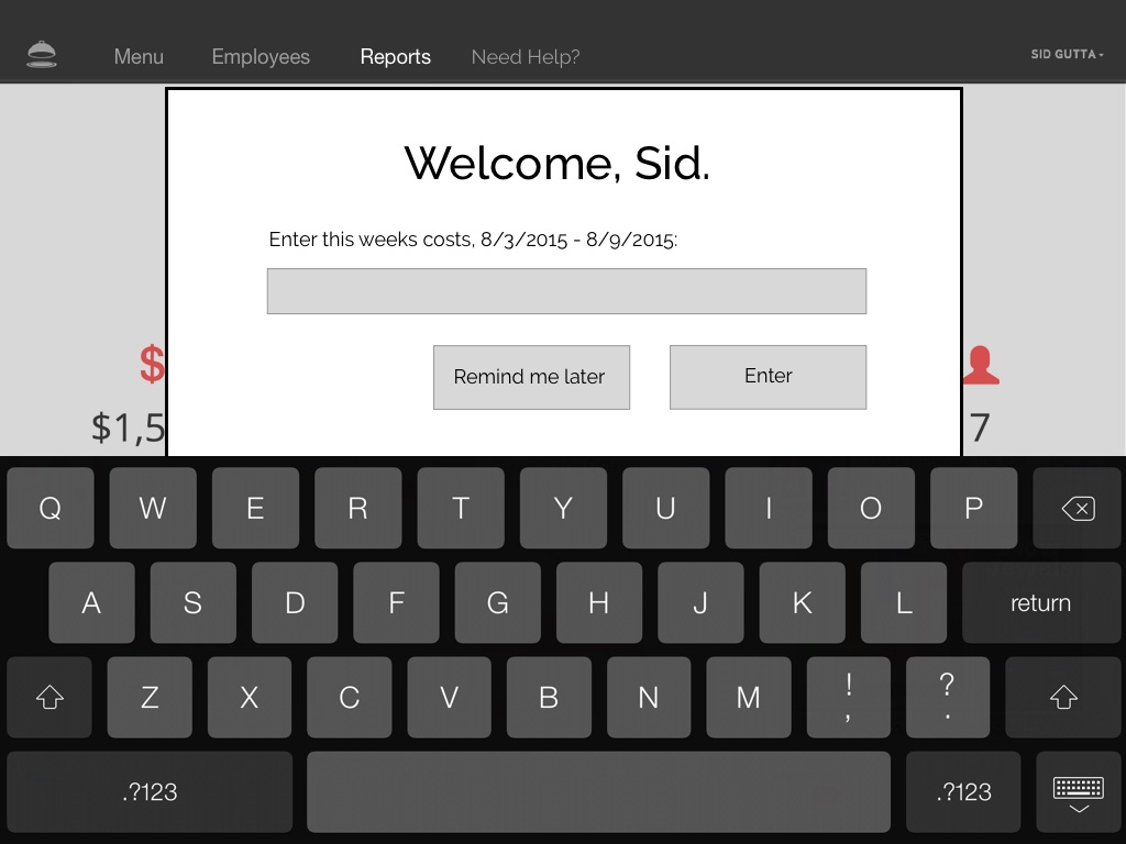
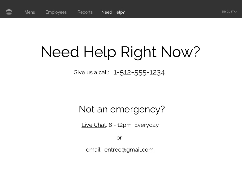
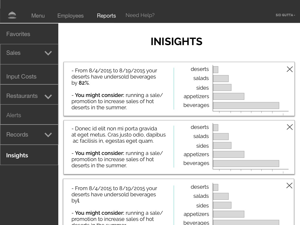
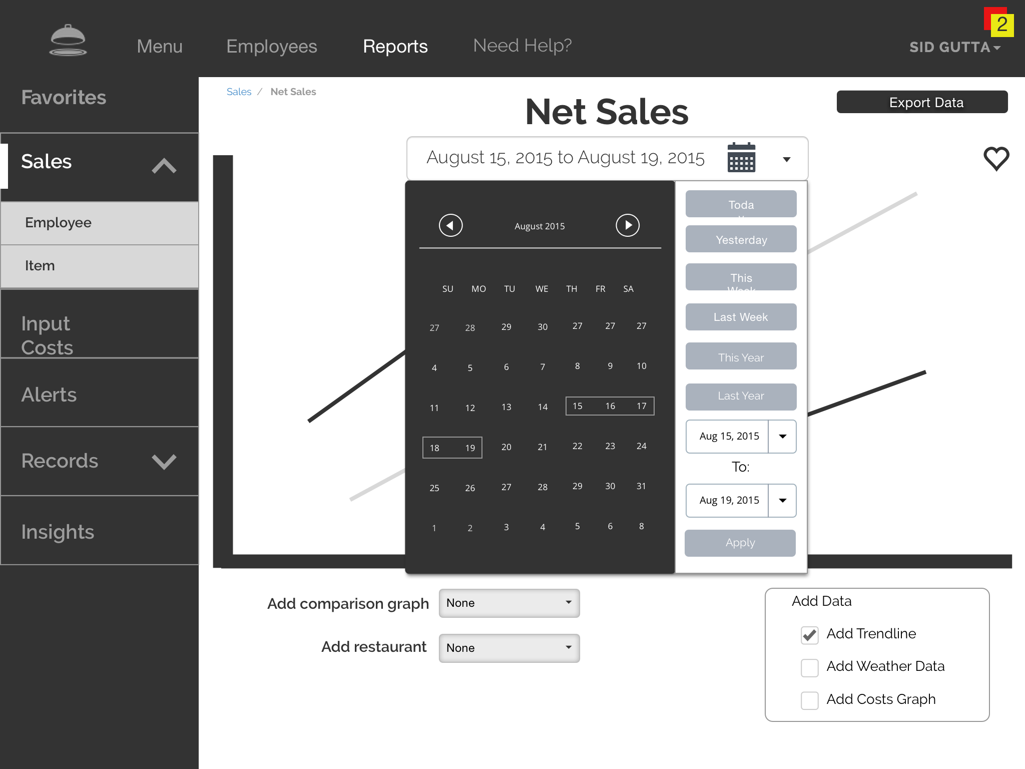
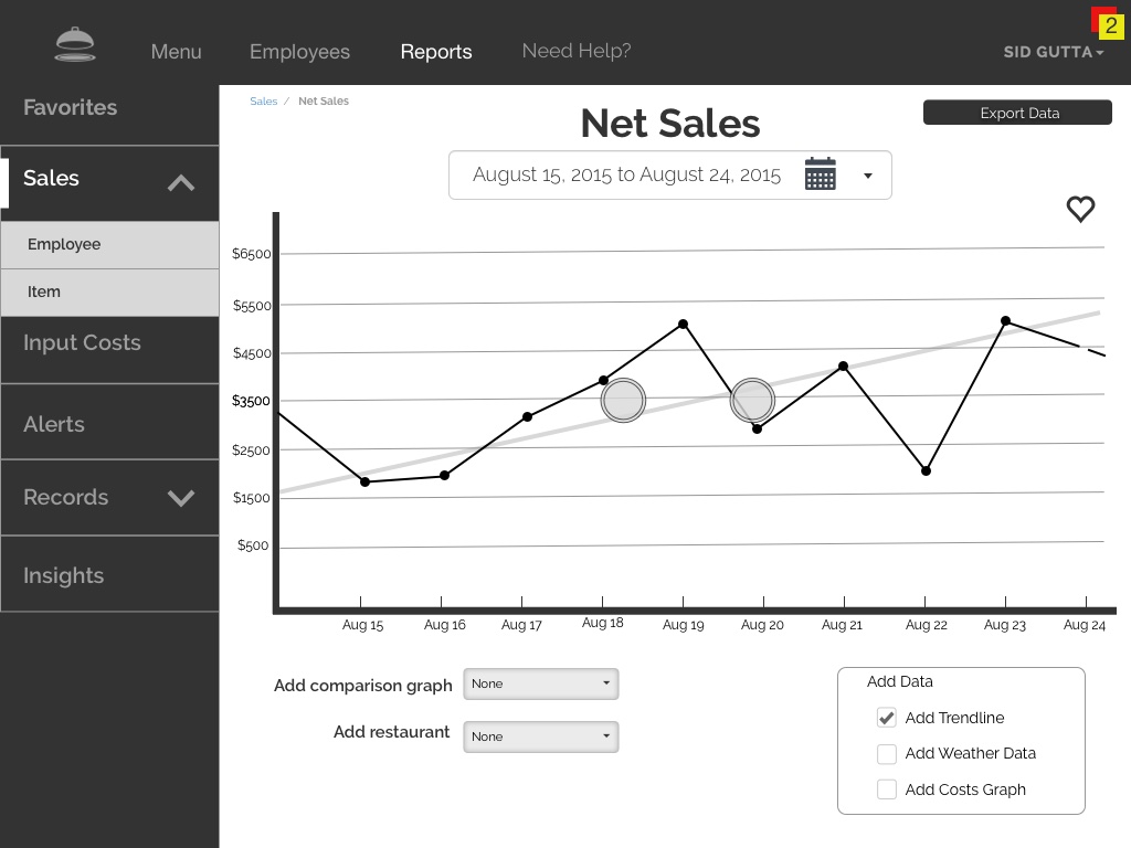
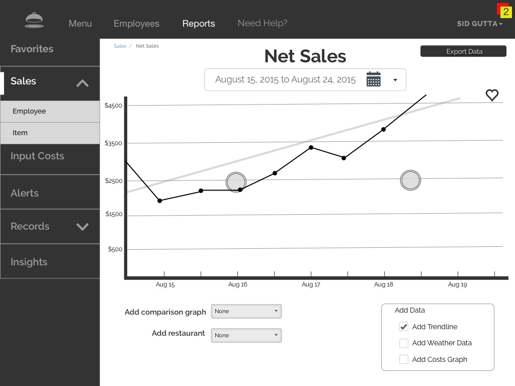
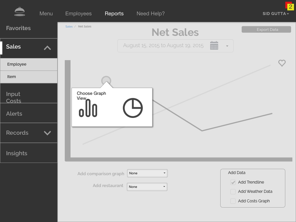
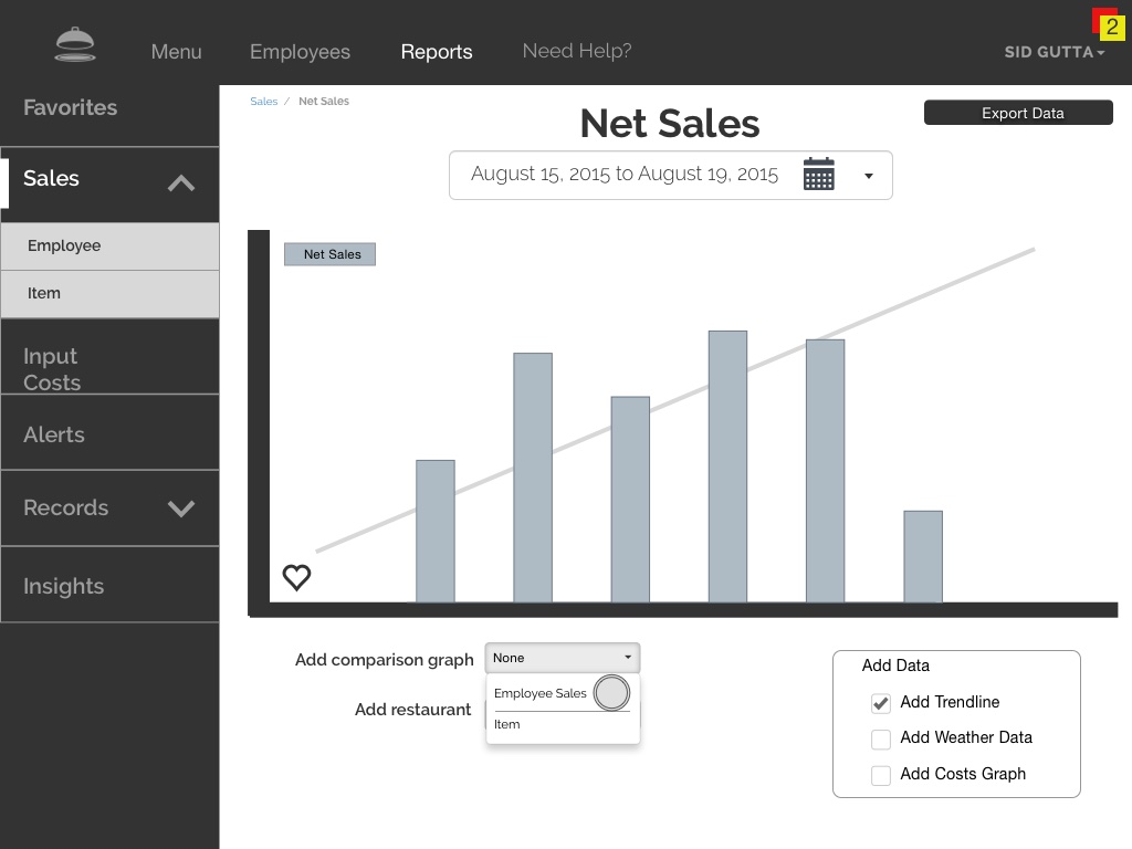
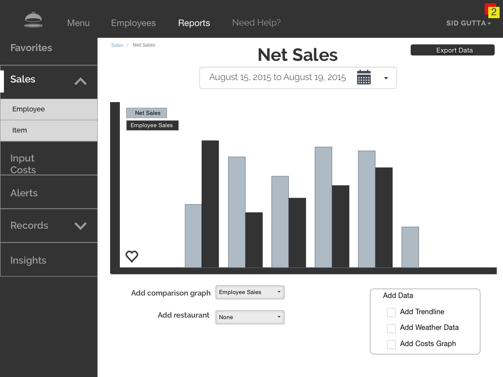
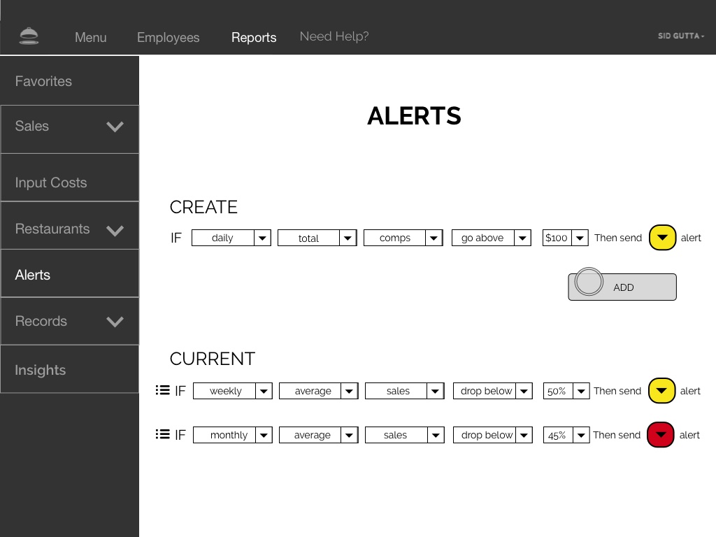
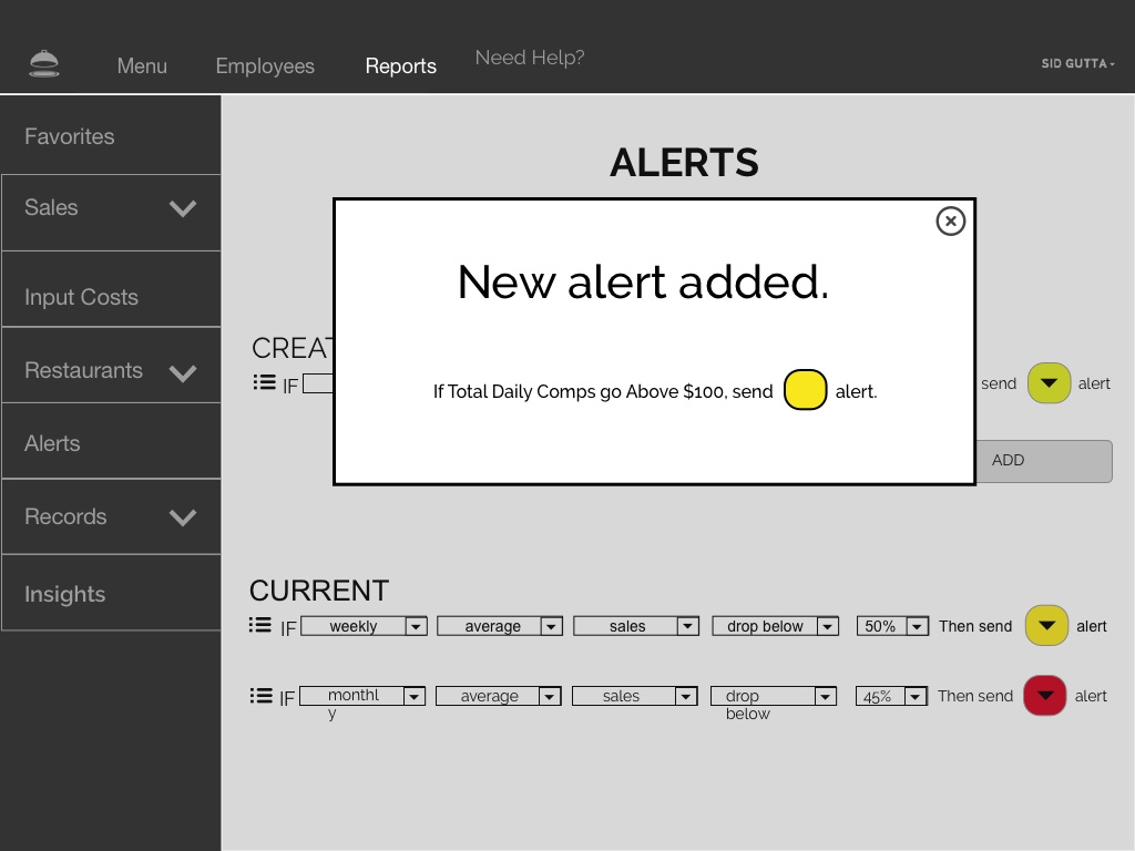
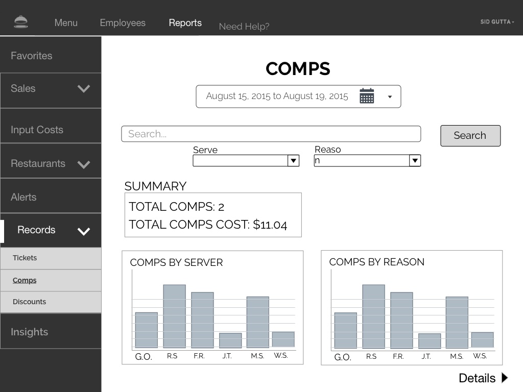
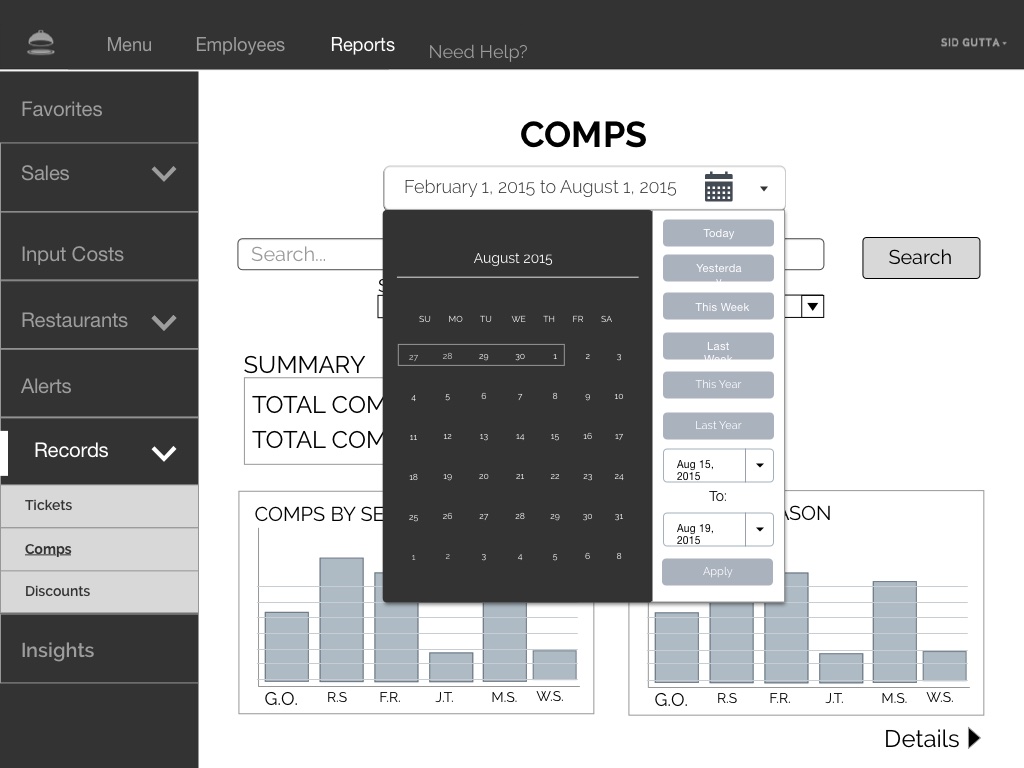
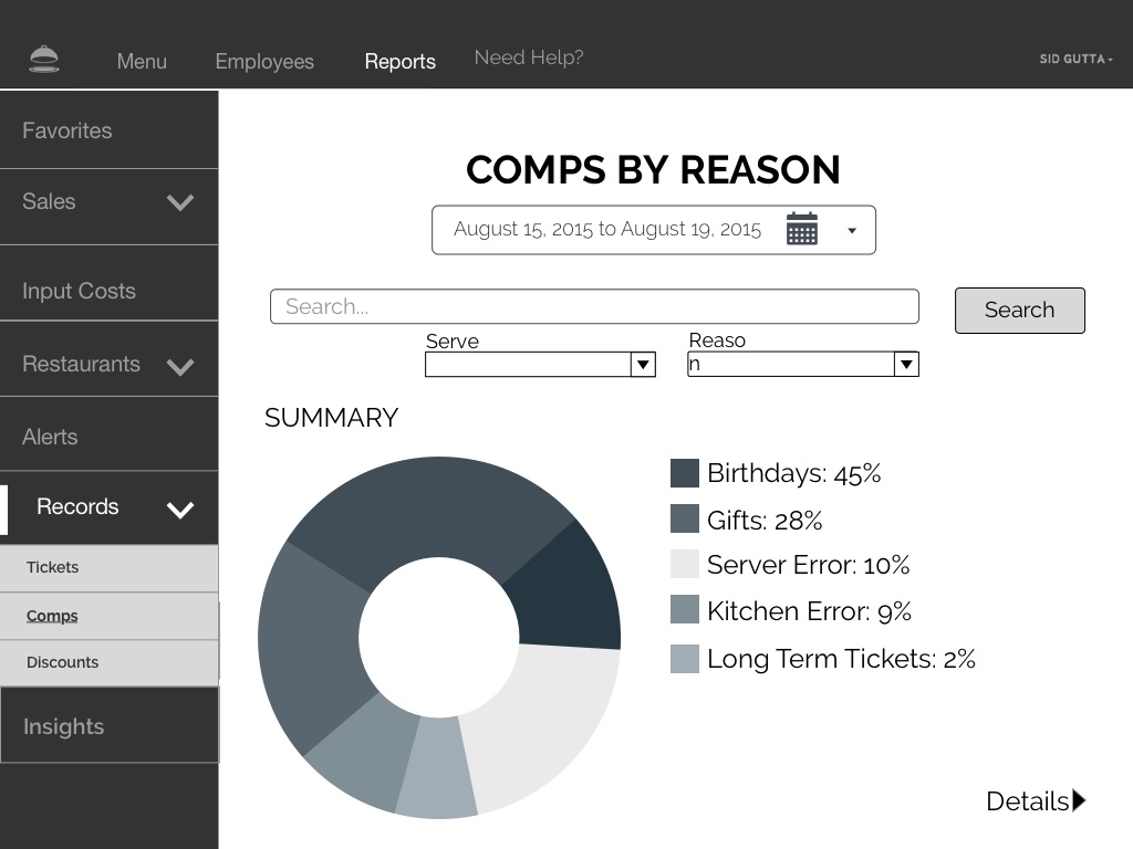
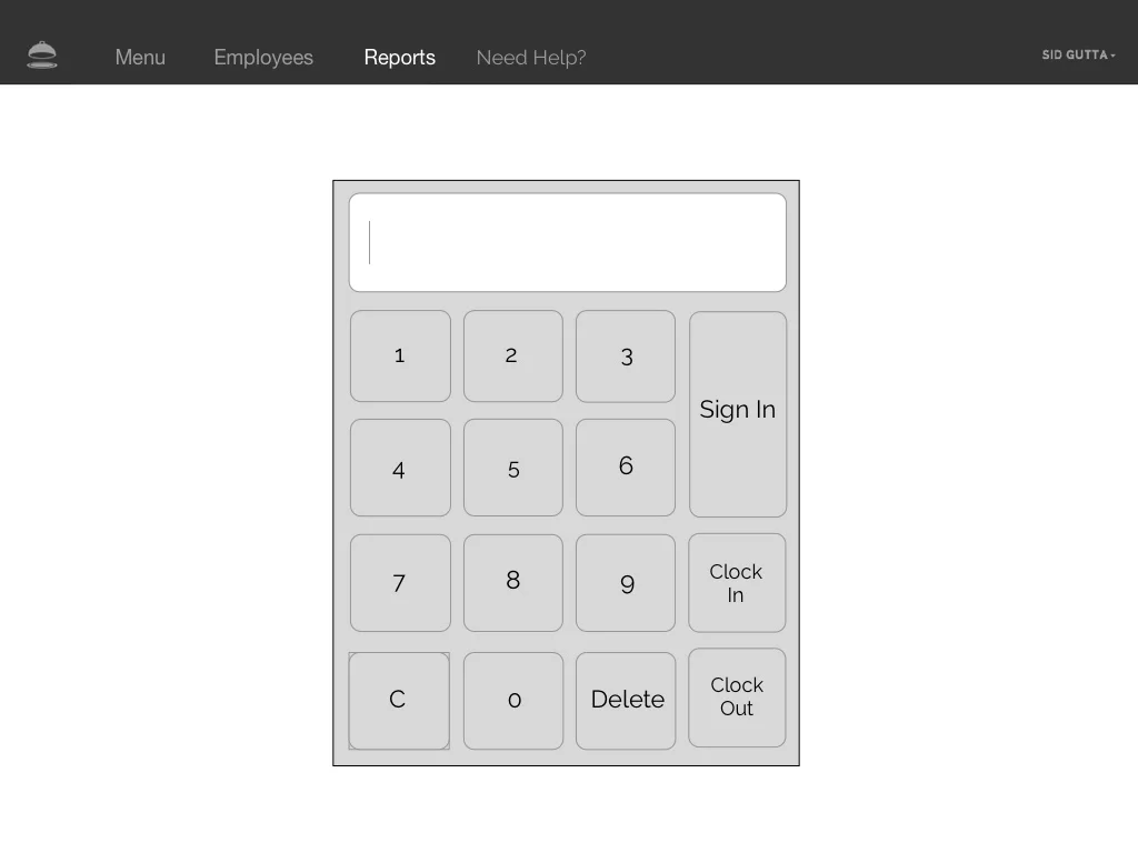
Final Deliverable - wireframes and clickable prototype
Entrée brand iconography
90% of restaurants are independently owned
contextual inquiry
onsite
developing a user blueprint
affinitization
affinity mapping
affinity map: user device preferences
user journey
primary persona
simple service blueprint
a sitemap takes shape
paper prototype
a quick runthrough of wireframes with annotations:
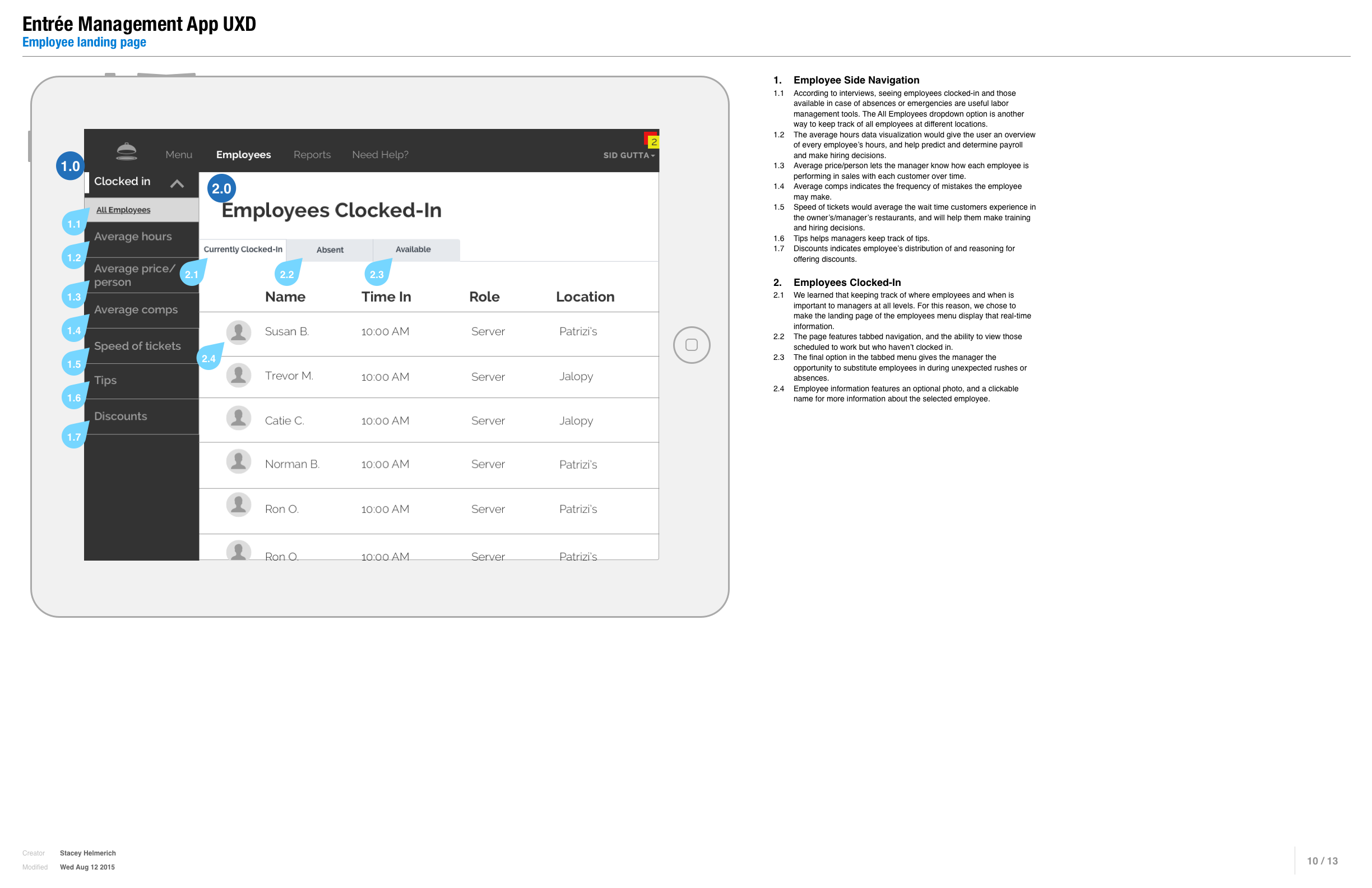
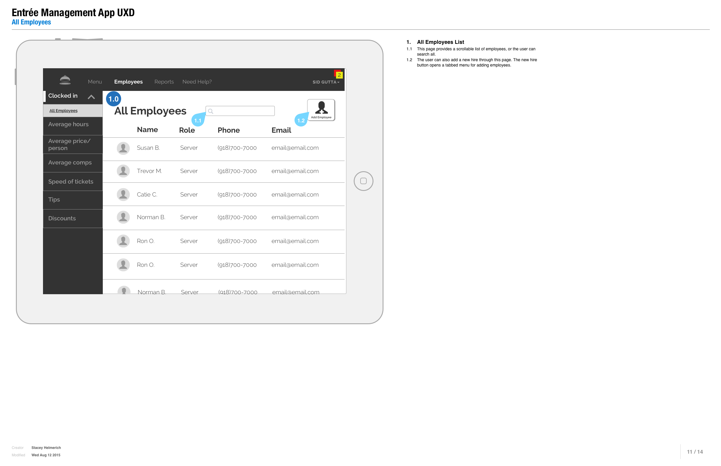
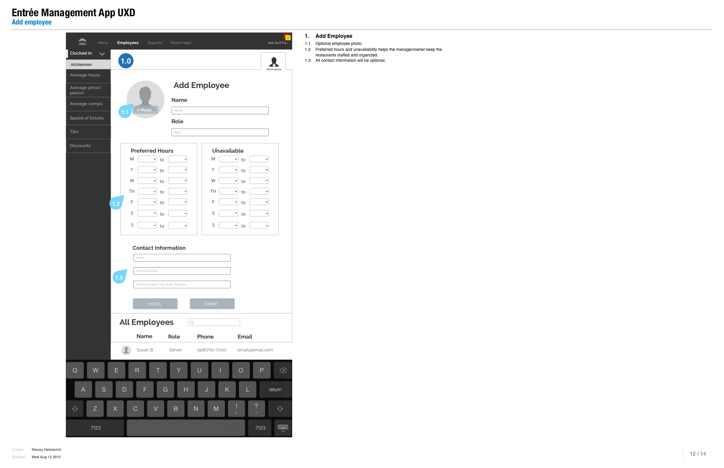
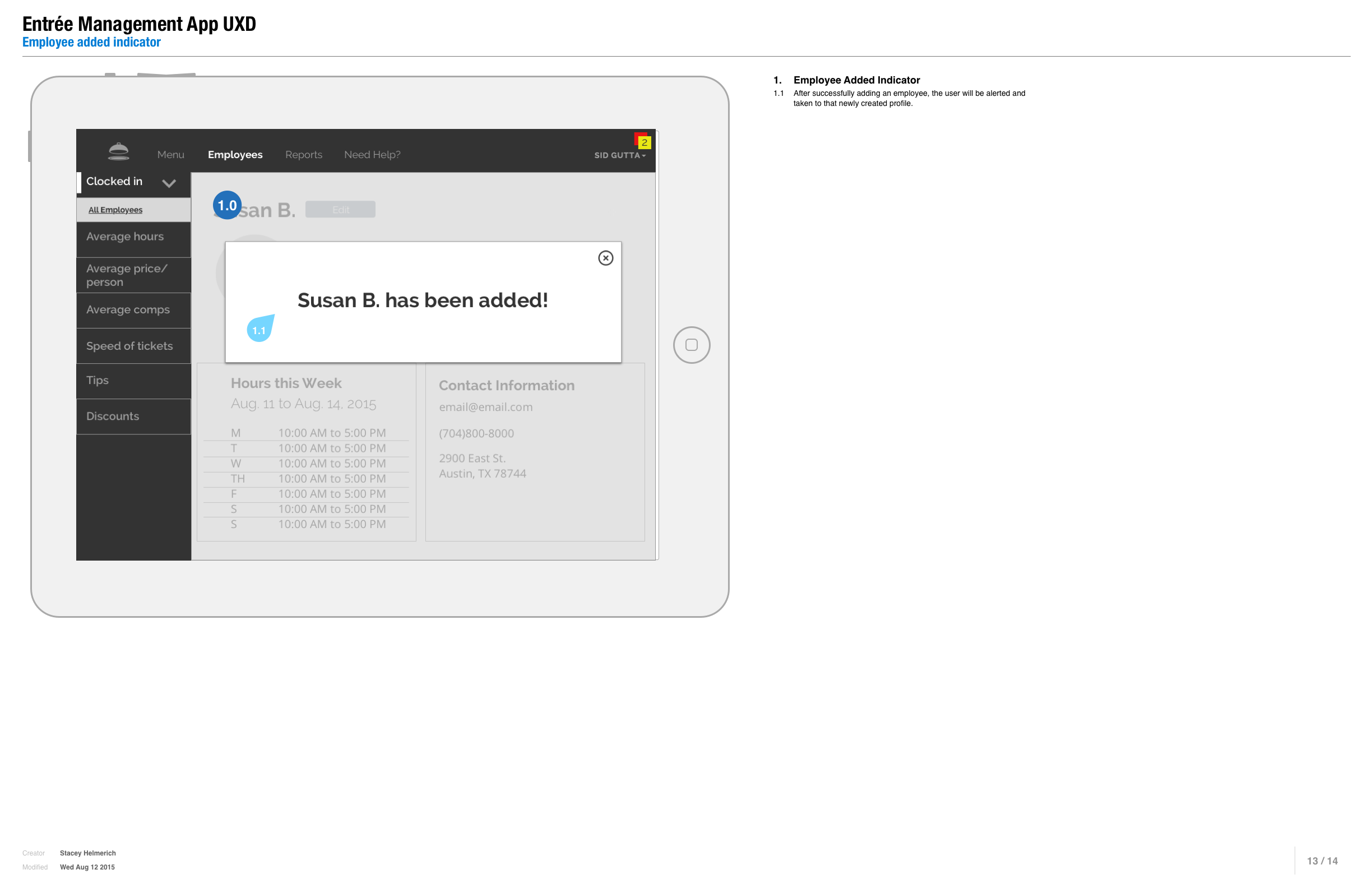
annotated wireframes
PROCESS
From our first stakeholder interview with the CEO, I knew we would be creating the back-of-house, management-facing portion of the Entreé project.
He informed us of a very saturated, but quickly growing market. Little did we know what we were facing when we began to research and quickly discovered over 100 other competitive electronic POS systems already on the market.
Stakeholder asks:
dynamic graphic reporting
the ability of possible future integration with other apps
a clean, material-design influenced look
simplicity and ease of use while providing functionality for both 'Full' and 'Quick Service' establishments
We began with contextual inquiries, visiting over a dozen restaurants to understand their current systems, pain points, and preferences.
We also did multiple rounds of user interviews with restaurant owners/managers, staff, and servers.
I realized that each establishment functioned mostly within its own ecosystem, with its own preferred devices and processes.
We performed a competitive analysis and began sketching mind maps and doing affinity maps with the needs and preferences we'd collected from our interviews.
We also developed a primary persona, user journey, and service blueprint to give us a design focus.
The biggest weakness with current POS systems seemed to be their tendency to run slow, or even fail during service. In fact, these were the cause of the biggest anxieties expressed in user interviews.
Based on the data I'd assembled, I came up with a set of principles and focal points to guide our design:
integration with existing tools
improved error prevention and software backups
improved customer support
high value with low price-point
efficient; no extraneous features
accessible reports from any device
easy setup
help with easing managerial burdens
With these as our guides, we began the design phase.
For clarity of the workflow, we decided to build a paper prototype that could help us get a real sense of how to design the user interface.
This was extremely helpful to unlock creative flows, and especially gave us some user testing opportunities that vastly improved the formation of the digital wireframes.
From there, I:
Simplified the top navigation to 'Menu', 'Employees', 'Reports'; I added a 'Need Help?' option as well to make sure users always felt fully supported;
created an easy 'Insights' page where managers could see system-generated evaluations and recommendations that could increase efficiency or delineate problem areas;
allowed users to compare multiple layers of real-time graphs quickly and easily switch graph types with a click-and-hold, and pinch-and-zoom to dial in or get a quick quantitative overview;
built an 'Alert' function page where managers could customize pop-up alerts with 2 specifications: 'important' or 'emergency';
and offered essential information for easy employee and menu item evaluation, addition, and subtraction.
We then tested the usability of a few of the flows with a restaurant manager, who gave us ample and useful feedback.
For the presentation to the stakeholder, we annotated a few frames to illustrate important flows. We also explained our work in an official statement of work (SOW).
TAKEAWAYS
Our research and interviews yielded some interesting takeaways:
The POS field is packed with competitors; but opportunities for good design are huge;
There is a huge degree of complexity unique to each restaurant;
Each restaurant is essentially its own unique ecosystem;
The technology of POS systems is meant to serve people who serve people;
Owners/managers are often too busy to even consider a new POS system;
Owners/managers need to be able to trust in the dependability of their chosen system, especially if it's new.
With reflection on the CEO's expressed needs in contrast to the saturation of the market, I told him that he ought to ground the app in an essential, bare-bones functionality to differentiate himself from the herd while better serving overworked and time-strapped managers.
Since the industry is so variable and people-focused, I thought it best for him to develop his brand with a meticulous 'white-glove' focus to truly fit user needs and develop brand loyalty.
If we had more time I would:
research the easiest potential integration with other 'most-used/wanted' apps;
research and whittle down to bare-minimum features;
refine and build out UI of reporting graphs and affordances;
carve more time for robust usability testing to continue refining the ease and functionality.
Next Project:


