Content Search Platform
OVERVIEW
I was asked to design an internal-facing search engine to help designers in marketing and advertising to quickly and easily find and track reusable content.
Design-Ops win: turned a fragmented asset workflow into a governed library, eliminating ≈30 % duplicate design work and streamlining dev consumption.
CHALLENGES
Upwards of 30%+ duplicative work being created by advertising and marketing design teams;
Designer’s and Admin’s inability to identify and reuse previously successful content;
No way for business to track the performance of different campaigns or components;
Designing within 3rd party constraints.
MY ROLE
I was the sole designer teamed with a Project Manager and Senior Engineer to conceive, design, and build the UX and UI of the product.
Research - Discover
I began by compiling and consuming the research that already existed, while also talking to stakeholders, SMEs, and the primary users to get a sense for what the real problems with the current system were.
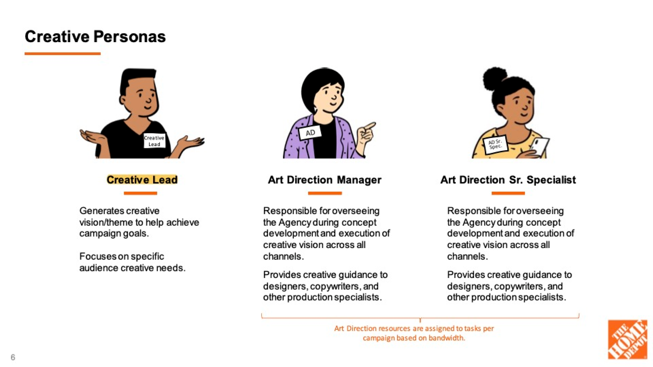
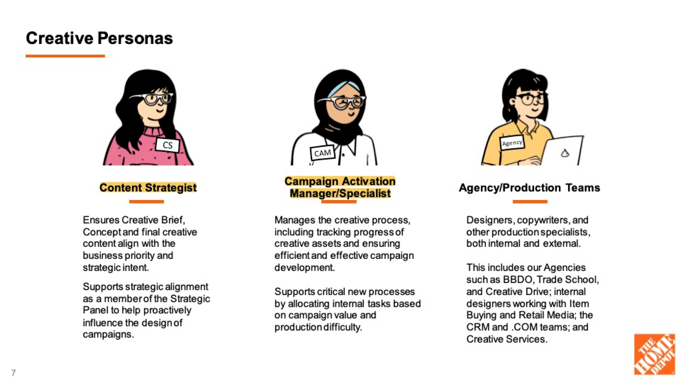
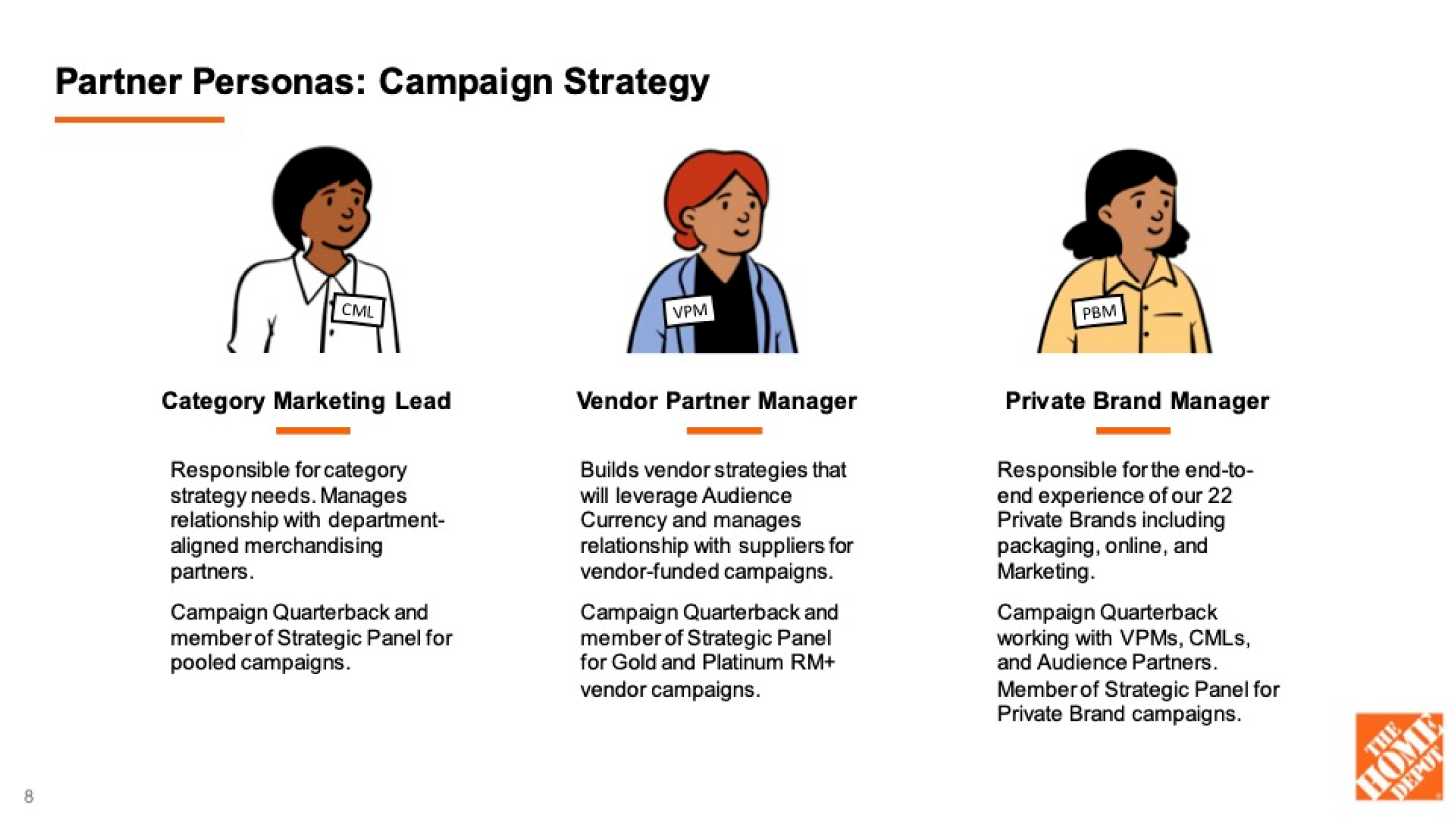
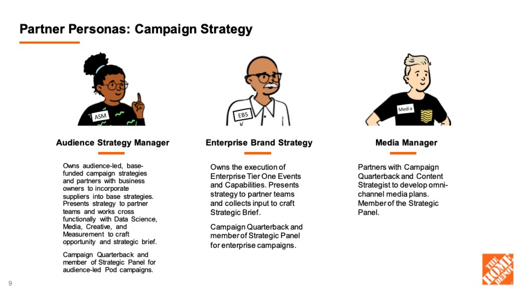
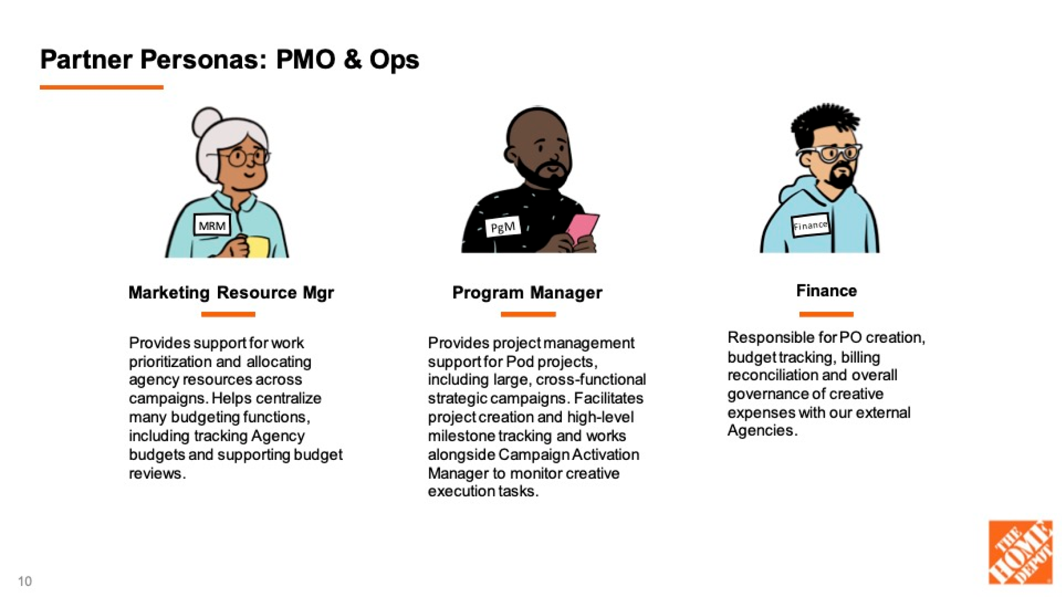
Persona research; primary user’s titles are highlighted
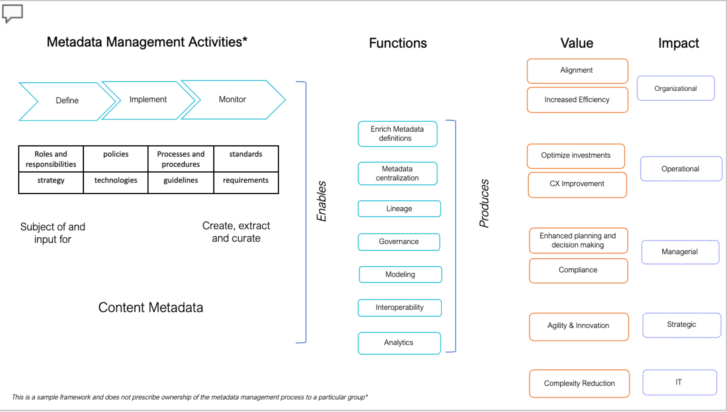

Some of the as-is systems and technical touch points
As I consumed what was available from business teams and SMEs, I also began conducting interviews with designers working in advertising and marketing to get a sense for their process and pain points.
These interviews helped me to begin to really understand the challenges they faced, and began to pull together a summary.
Synthesis - Define
Digesting the research, I began to clarify insights and pain points, and deduce opportunities.

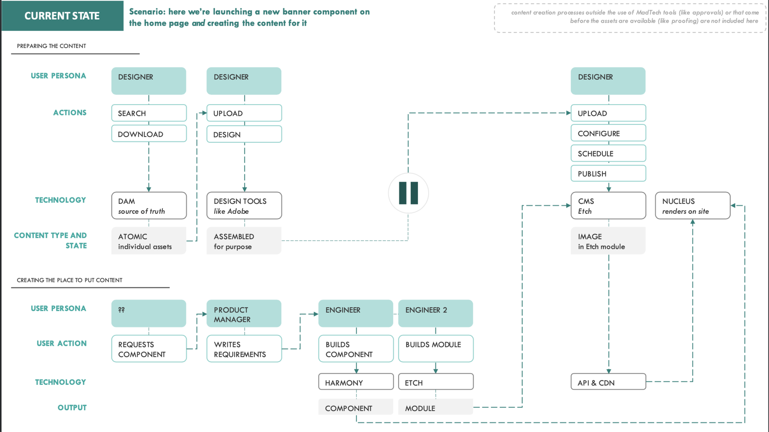
Systems process and integration, proposed

Concept of how the ideal flow could function
Based on the structure of the current system, and pulling from one on one interviews, I began to surmise some primary issues:
Painful User Experiences
Excessive manual updates and changes required
Odd and difficult scheduling of content
Toil of creating anew each time left little room for creativity or strategy
Chaotic system structure left users feeling overwhelmed
Loss of Efficiency
Because each project was unique, approval process was too time-intensive
Duplicative work - up to 30% of work unknowingly recreated
Not able to fully pursue more personalized production
Fragmented Customer Journey
Inconsistent messages and styles at different touchpoints
Irrelevant content and messaging for certain customers
Lack of quality or connection of content across platforms
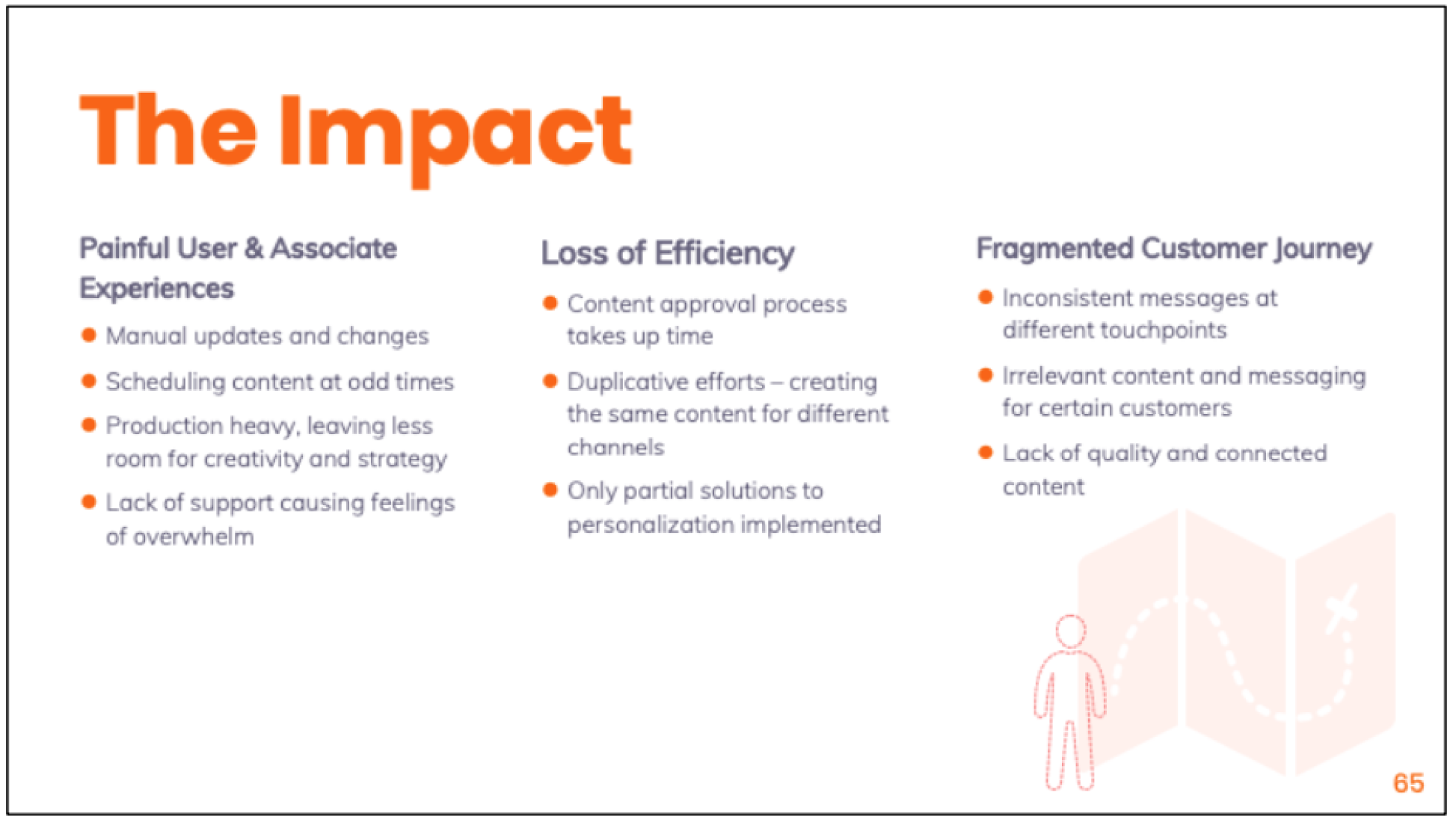
Summation of the problems inherent to the current system of data collection and publishing
We agreed that our MVP would focus on serving the primary users: a search platform built for designers, with the intention of making their process and easy and seamless as possible.
So I began to gather data and input towards what that better search experience might look like.

Primary focal points and quotes gathered from initial user research: search performance and result preferences
Ideation - Develop
I began implementing the findings into a series of viable, iterative designs through wireframes and mockups.
Initial wireframing
I knew I would want to surface relevant and pertinent content as a primary focus.
So early designs considered passively surfacing two frequently sought features:
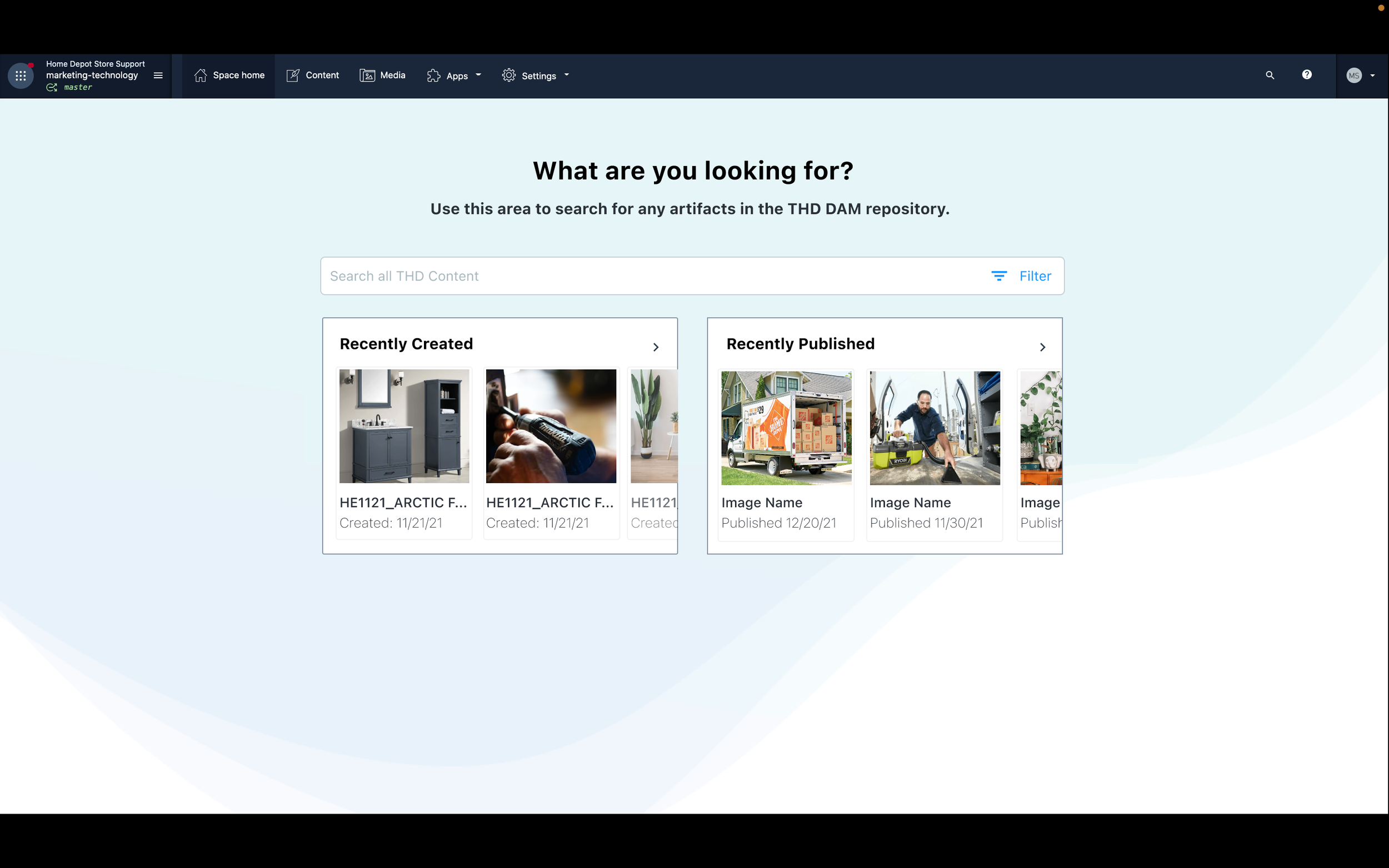
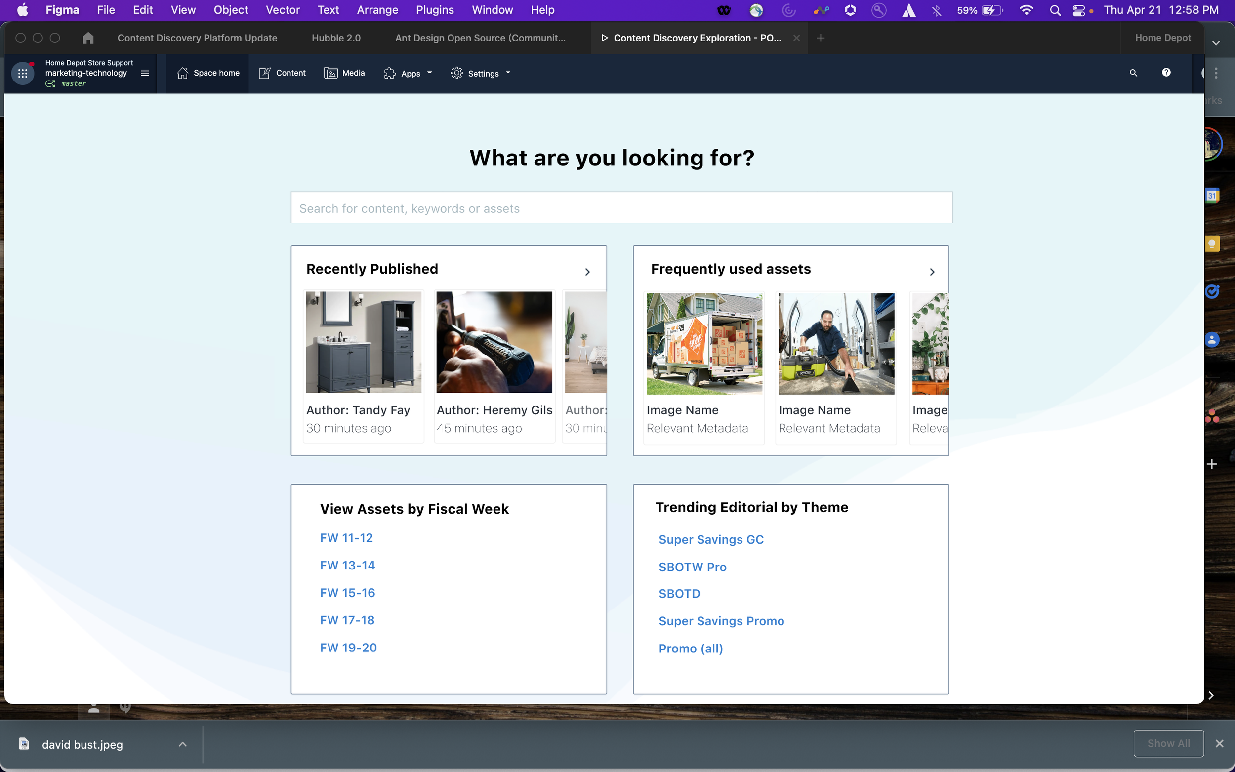
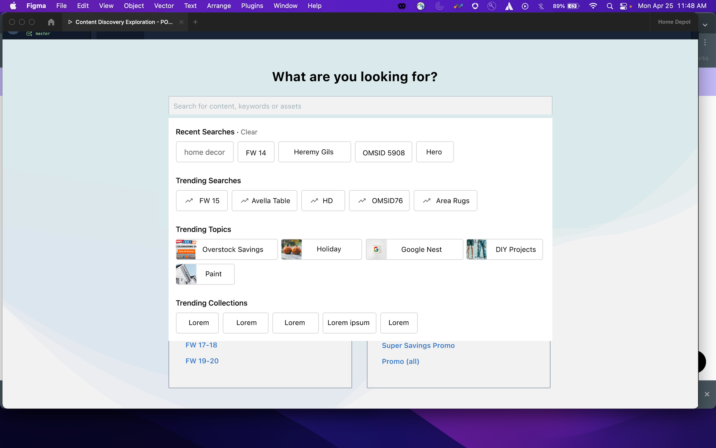
‘Recently Published’, and ‘Frequently Used’ below the search bar, visible before they even started the search.
I also played with other ways users could filter and refine content, such as:
‘View Assets by Week’ and ‘Trending Editorials by Theme’.
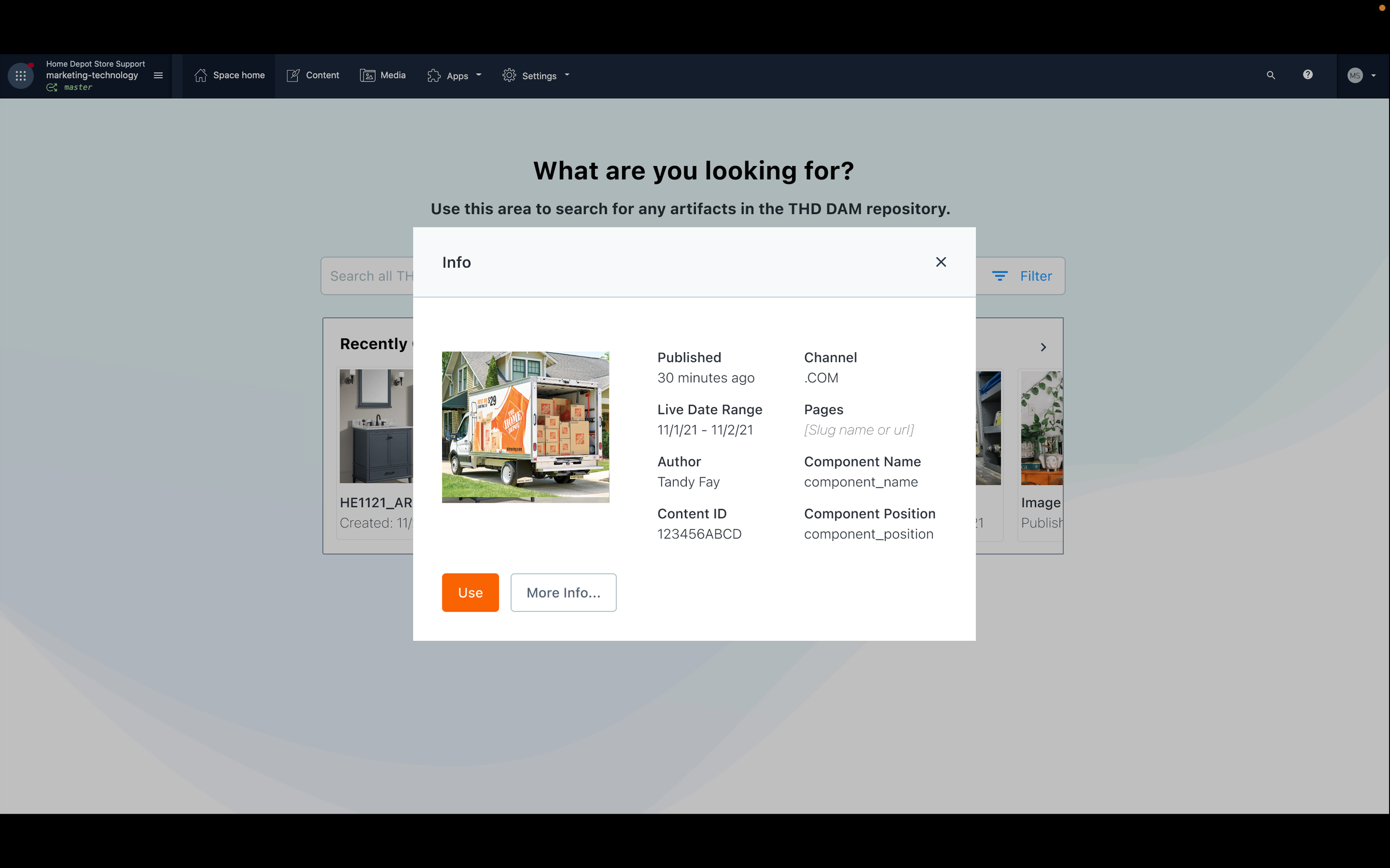
In other early deigns, in order to surface other more relevant, personalized data to assist users more quickly, users could on a thumbnail image, allowing a popup window to show metadata related to that component.
After discussing of these ideas with IT and Business partners, I realized that some of these features would not be possible for the MVP release.
So I updated the UI to accommodate, as well as adding new, more powerful sorting and filtering options, in part to match the functionalities offered in the 3rd party CMS.
This included a ‘grid’ vs ‘list’ view.
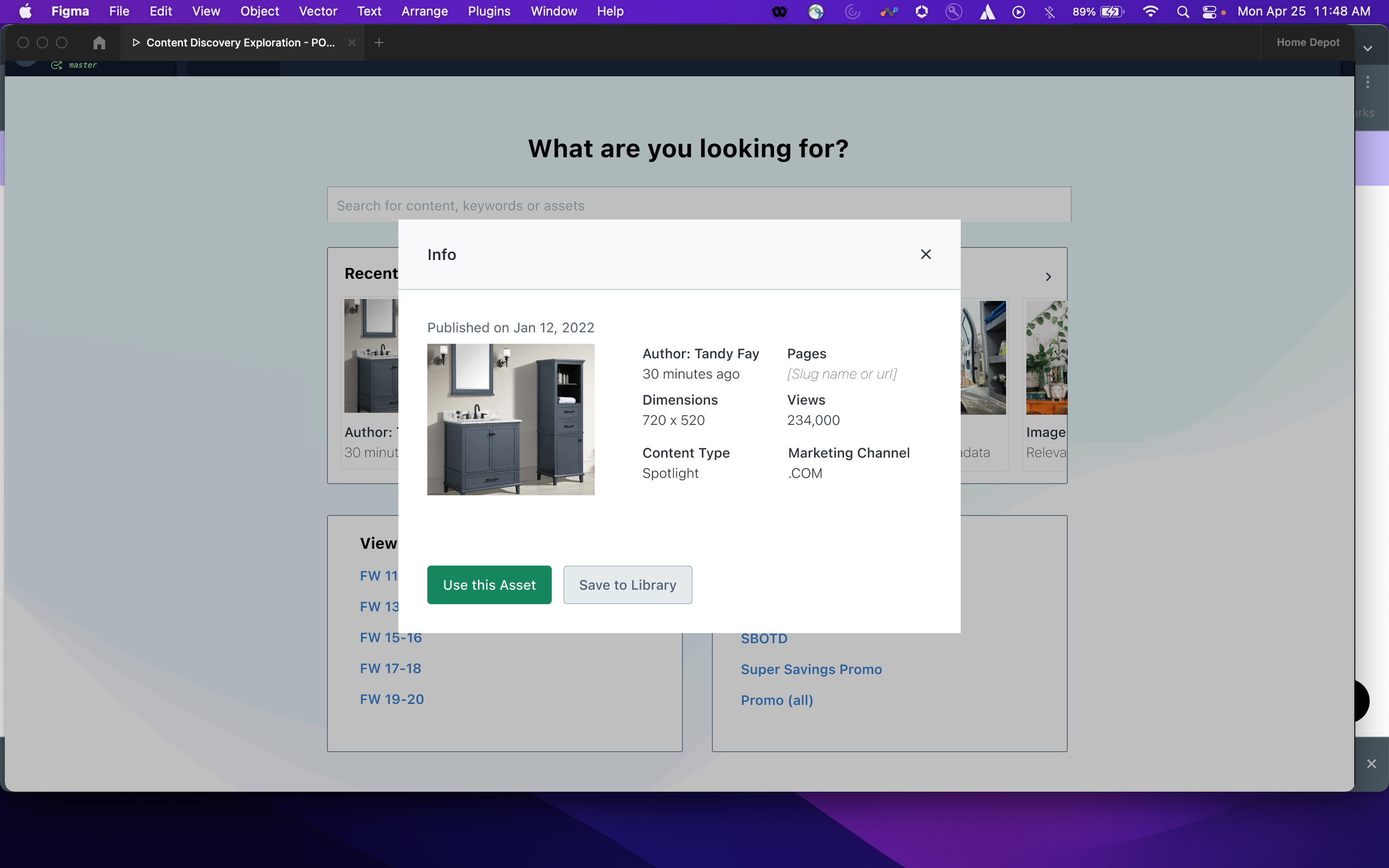
I also decided a tooltip box on hover would quickly give users clear insight into the most pertinent metadata for each component.
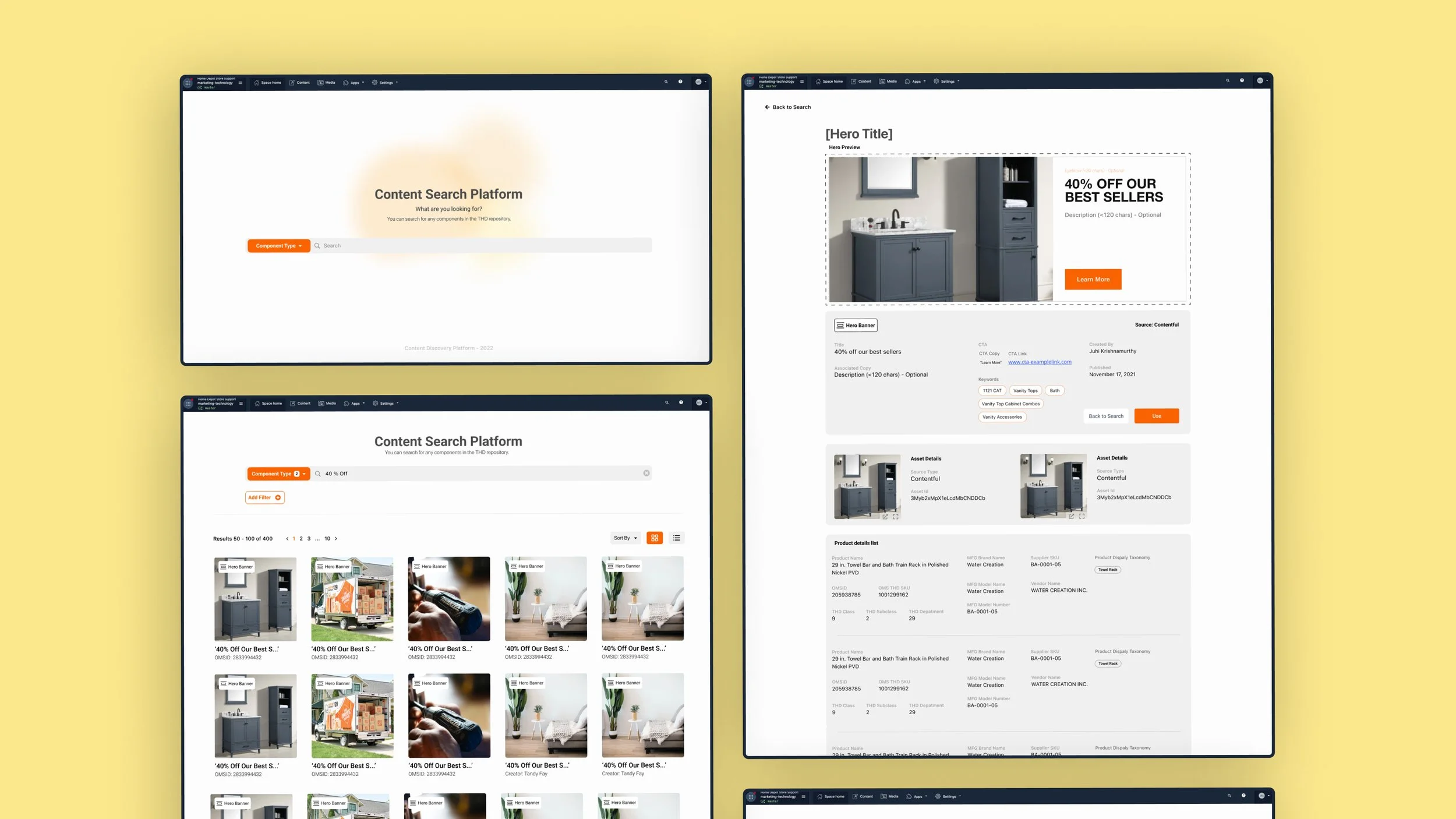
Updated grid search return with more powerful search functionality
On-hover tooltip UI to offer better insights into component data
Subsequent evaluative user testing with the new designs led to informative insights. Specifically:
Filter and sort in the same search bar was more confusing than not;
'Recently Published’ was not a particularly important filter parameter for designers;
A Sorting functionality would be preferred;
Users often seemed confused as to the thumbnails content; so I added a component tag in the image corner to clarify
Refined verbiage that would make more sense to users

Powerful search filtering and sorting
Ability to view results in a grid or column layout; expanded view
Continued refinement simplified to landing page, while adding brand colors; building a detailed, ‘More Info’ page
Clean, simple UI; focused on selection of component type dropdown, with brand colors
More Info page - allowing a detailed description of all associated data and artifacts
Implementation - Deliver
Working directly with engineers and using Figma as a single source of truth, I delivered high-fi mockups and prototypes for final production, while continuing iterative updates.
Continued testing helped to refine the way we were presenting information, with more results per line
Filter moved to tags below the search bar; added bread crumbs
Integration with Contentful - We needed to fully integrate the product into the CMS systems the designers were already using to actually build their campaigns and final deliverables.
But we discovered at the last minute that the 3rd party would not be able to accommodate our MVP design. So we were faced with a problem, forcing us to think on our feet:
We came to realize, though, that there were 3 areas in the existing platform we could work with:
the side info bar;
individual sections on the main page;
and the pop up modal.
So, after some fast brainstorming - we realized we could simply plug the current design directly into the popover modal - allowing users to search directly within the context of where they were already working.
And then, to take advantage of the side bar and in page options, we tested two variations: one CTA in the sidebar, and the other in-field, which would automatically call the pop up window so they could easily find what then needed, and plug it directly into their project.
First round: Large solid-blue Hubble in-field CTA
After testing: more subtle, blue stroke and removed 3rd CTA

Addition of the new ‘Hubble’ Logo above (internally crowd-sourced)
PROCESS
From my initial research, I knew I needed to build an MVP that could ease the user’s process of searching for and creating new designs, while simultaneously increasing efficiency and ease of tracking the performance of various elements and campaigns.
Working closely with a ‘3-in-a-box’ team alongside a Product Manager and Lead Engineer, I performed additional, iterative research concocting a design that we were able to continue refining.
In order to deliver a high-performing design, I performed multiple rounds of iterative usability research to continually refine and improve the product
Though the issue with the CMS housing platform initially seemed like it might derail us, it was the quick, flexible thinking of my incredible team that allowed us to pivot and come up with what turned out to be a powerful, and elegant solution.
Luckily this tested incredibly well, and went into production soon after, as I continued to test and refine the design.
TAKEAWAYS
It was an incredible experience to get to work so closely with such a wonderfully smart, humble and agile team, and get a chance to build more hands-on UI design skills.
The new library ‘feels like autocomplete for assets’
– Sr. Marketing Designer.
Upon completion, I had:
Led the design of a powerful content search platform that would allow users to find previously created content, and allow managers to track the performance of pages as well as individual pieces of content;
Built a powerful new user experience that would greatly reduce users creation time, as well as increasing efficiency and traceability of assets across the companies various platforms.
With more time, I would:
continue to refine the design to suit novel contexts as we continued to scale to other parts of the company;
use the newly obtained performance data to refine the design and concepting;
deepen my understanding of the process of designing within this new system.
Next Project: