
Interactive Reservation Platform
OVERVIEW
Project: Rodeo Logistics Interactive Platform
Focus: Designed and launched a responsive interactive map that reduced manual reservation errors by 20% and improved contestant onboarding speed by 40%.
Scope: Oversaw research, design, and development of both the interactive map and the broader Open Stalls platform.
IMPACT AT A GLANCE
20% reduction in manual reservation errors
40% improvement in contestant onboarding speed
Designed for 300+ contestant events across multiple arenas
End-to-end design from research through hi-fi delivery
PROBLEM STATEMENT
Rodeo event organizers relied on spreadsheets and paper maps to manage contestant flow and logistics. As events grew—sometimes with 300+ contestants across multiple arenas—this manual process became error-prone and chaotic.
Staff often spent hours reconciling schedules, while contestants reported missed runs, long delays, and confusion about stall assignments.
The outdated system created frustration for both participants and organizers, while limiting the event’s ability to scale.
CHALLENGES
The primary challenge was to design and develop an interactive mapping feature that gave both rodeo operators and contestants real-time visibility into each arena, stall, and event schedule.
This feature needed to replace static paper maps with a dynamic, intuitive tool that reduced confusion, minimized delays, and scaled seamlessly for high-volume competitions.
Beyond the mapping tool, I also supported broader platform updates to improve overall usability and efficiency.
MY ROLE
As Senior Product Designer, I led the end-to-end design and development of the interactive mapping feature — with research through to prototyping and testing — while also contributing to platform-wide updates to improve usability and scalability.

RL platform signup flows - Mobile + Desktop
Research - Discover

An example of some of the data tracked for events via Excel


Ethnographic research: onsite at the Fort Worth Stockyards
Conducted stakeholder interviews to uncover pain points in stall booking, focusing on scheduling inefficiencies and lack of real-time visibility.
Audited the existing ‘Open Stalls’ platform to map user flows and identify friction in user autonomy and navigation.
Analyzed competitor platforms to benchmark self-service capabilities and assess innovation gaps.
Synthesis - Define
Consolidated findings into basic behavioral personas representing venue managers, riders, and logistics coordinators.
Mapped key user journeys and pinpointed opportunity areas for automation and interactive mapping.
Prioritized features using a value-effort matrix aligned with business goals and user impact.
Ideation - Develop
Implementing the findings into viable, iterative designs through wireframes and mockups.
Facilitated collaborative sketching sessions with PMs and engineers to explore solutions for real-time bookings and map integration.
Generated multiple wireframe concepts in Figma, iterating based on team feedback and usability insights.
Prototyped a dynamic scheduling interface that emphasized autonomy and reduced user dependency on support.
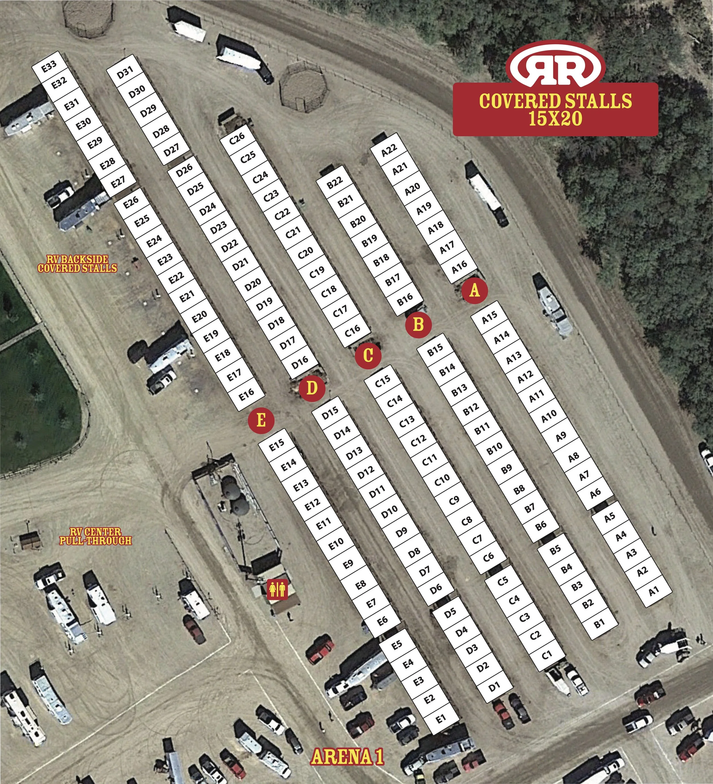

Building designs of interactive site map coordinates
Implementation - Deliver
• Designed step-by-step flows for booking, scheduling, and stall management, creating annotated Figma files to guide future development.
• Delivered high-fidelity prototypes with interaction details, accounting for known technical constraints and user needs.
• Collaborated closely with engineering to explore implementation pathways, though platform decisions were still evolving at the end of the engagement.
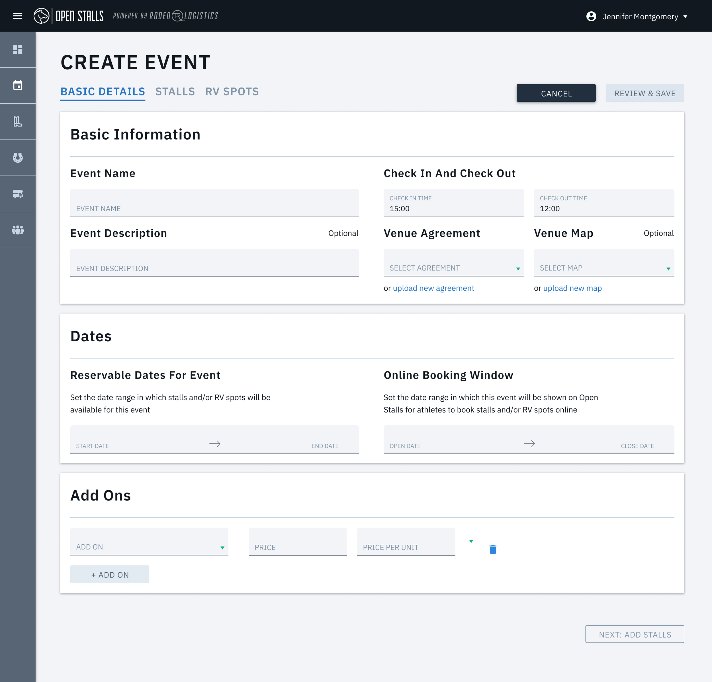
‘Stall Booking’ Flow using interactive maps - Desktop

‘Stall Booking’ Flow using interactive maps - Mobile
Subsequent user testing with the new designs led to informative insights. Specifically:
Users wanted clearer labeling on the map, so I refined iconography and text placement.
Operators preferred seeing the overall flow first before details, so I adjusted the default view to show a higher-level map on load.
Some users felt the onboarding steps were confusing, which led to adding short helper text within the interface.
Users needed clearer confirmation of updates → added toast notifications and status indicators to reinforce successful actions.
PROCESS
From the initial research, I developed a design that sought to address the 2 primary pain points:
Error-prone, manual onboarding & reservation process
The existing flow relies heavily on spreadsheets, paper maps, and manual data entry. This leads to frequent mistakes (reservations mis‐entered, mapping errors), delays in onboarding contestants, and friction in tracking logistics during events. Because things are manual, scale and complexity exacerbate the issues.Lack of real-time visibility and coordination
Stakeholders (event staff, contestants, logistic managers) do not have a unified, dynamic view of where contestants or resources are, or the current layout/spatial arrangements (stalls, movement, scheduling). Without interactive mapping or tools that support mapping + reservations + updates, it’s hard to adjust on the fly, detect problems, communicate changes, or see the “bigger picture.”
In order to deliver a high-performing design, I made sure to do iterative usability research to continually refine and improve the results
TAKEAWAYS
This was an awesome experience for me to work within a new framework much more closely with dev teams and my PM, and get some more hands-on UI design skills.
✨Upon completion, I had:
Delivered an MVP design that streamlined onboarding and stall assignment into a clear, digital workflow.
Translated manual, error-prone processes into a scalable, interactive system that reduced mistakes and improved speed.
Validated core flows with users, confirming that the design addressed the biggest pain points of visibility and accuracy.
Partnered closely with product and engineering to ensure feasibility and alignment with business goals.
With more time, I would:
Conduct broader field testing at multiple events to validate real-world performance under pressure.
Add advanced features such as predictive stall allocation, automated conflict resolution, and integrated notifications.
Expand the design system for consistency across future Rodeo Logistics tools and potential new platforms.
Explore analytics dashboards for organizers to track usage, identify bottlenecks, and inform event planning decisions.
Next Project: