Designing Search for an AI-Powered Sales Intelligence Platform
OVERVIEW
Project: Halo Call Summarization — Persistent Search
Role: Lead UX Designer
Scope: End-to-end UX design; Figma Make AI-powered layout exploration
Company: Xpanse / Freedom Mortgage
IMPACT AT A GLANCE
Cut call lookup time ~85%, from 3-5 minutes of manual scrolling to under 30 seconds
Unified 4 siloed search surfaces into one persistent experience
Designed for 500-800+ daily active Loan Advisors and Sales Managers nationwide
Eliminated the platform's single biggest workflow gap: zero search capability existed before this
State-preserving category switching lets users explore across surfaces without losing context
PROBLEM STATEMENT
No search capability existed within Halo, Xpanse's AI call summarization platform. Loan Advisors and Sales Managers had no way to look up, sort, or filter call records by borrower, advisor, phone number, or loan ID — the only path to a specific call was manual scrolling.
A critical technical constraint shaped the entire design direction: the underlying database required a primary category to be selected before any query could execute. Users had to choose between four search surfaces — Loan Advisor, Sales Manager, Phone Number, or Loan ID — before any results could be returned.
CHALLENGES
Rather than hiding the category constraint, the design needed to make it feel intentional — a guided starting point rather than a limitation. Additional challenges included:
No legacy system to build from — this was a net-new experience designed from scratch
Designing for two distinct user types with different primary search goals
Maintaining search state when switching between categories so no work was lost
Surfacing date range and campaign filters without cluttering the initial experience
Establishing a search pattern in a product with no established precedent
MY ROLE
Lead UX Designer — responsible for end-to-end design from initial research through hi-fi delivery. Used Figma Make (AI-powered layout exploration) to rapidly iterate on structural approaches and identify the progressive disclosure model before committing to detailed wireframes.
THE DESIGN
Screen 1 — Landing State: Category Selection
The user lands on a clean interface with four distinct buttons, one for each primary search category: Loan Advisor, Sales Manager, Phone Number, and Loan ID. This intentional first step satisfies the technical constraint while giving users a clear mental model of what they are searching within.
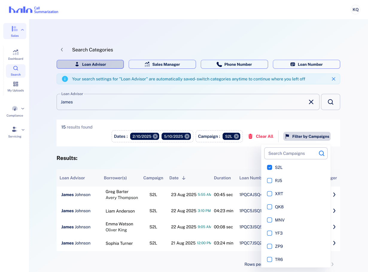
Screen 2 — Search Results with Persistent Category Tabs
After selecting a category, that section minimizes to a persistent tab bar at the top. The search bar and results appear below, keeping context visible at all times. Keyword matches are highlighted inline within results.
Screen 3 — Date Filter
A date picker with preset options (Today, This Week, This Month) and a dual-month calendar view allows users to narrow results by call date without leaving the search flow.
Screen 4 — Active Filter Chips
Applied filters surface as chips below the search bar, showing total result count and making it easy to modify or remove individual filters at a glance.
Screen 5 — Campaign Filter Dropdown
A dropdown with checkbox-style multi-select enables Sales Managers to filter results by campaign tags — a key workflow for pipeline review.
Screen 6 — Expanded Borrower Results
When searching by Loan Advisor, results expand to show stacked borrower entries with associated Sales Manager and Campaign columns — giving advisors a complete picture of their pipeline in a single view.
TAKEAWAYS
Designing around a technical constraint — rather than against it — produced a cleaner user experience. Forcing category selection upfront became a feature, not a flaw: it reduced cognitive load and made the search interface immediately comprehensible to both Loan Advisors and Sales Managers.
Using Figma Make to explore layout patterns before wireframing saved significant iteration time and surfaced the progressive disclosure approach that became the defining characteristic of this solution. The result: a persistent, stateful search experience that works within the system's architecture while feeling natural to users.