LOS Redesign — Modular AI Platform
OVERVIEW
Project: LOS Redesign — Third-Party Ordering & Document Management Center
Role: Lead UX Designer (processor experience)
Scope: End-to-end UX design; Figma Make + Magic Patterns (third-party ordering phase), Claude Code (Document Management Center phase)
Company: Xpanse / Freedom Mortgage
Timeline: February 2026 – May 2026
IMPACT AT A GLANCE
Ground-up redesign covering the full loan process — sales/outreach through acquisition, document gathering, underwriting, and closing
Owned the processor experience across two phases: third-party ordering, then the Document Management Center
Replaced a legacy system where tracking multi-layered documents and vendor interactions was the core workflow failure
Positive reception across four groups: internal stakeholders, external lending partners, the platform vendor’s engineering/success team, and Processors testing the flow directly
Averaging a 40% reduction in project time to completion for Loan Officers
PROBLEM STATEMENT
Legacy third-party ordering made it difficult to track documents and vendor interactions across multiple layers — that was the core “before” pain for Processors, who go back-and-forth with clients gathering required docs (W-2s, paystubs, tax returns, etc.).
No unified system existed for managing that document flow either. That absence was the core problem the second phase — the Document Management Center — was built from scratch to solve.
CHALLENGES
This was a two-phase build with two different toolchains, heavy cross-functional dependencies, and no existing pattern to design from. Specific challenges included:
Designing across two distinct phases with two different toolchains — Figma Make and Magic Patterns, then Claude Code
Heavy cross-functional coordination: Jordan (sales design), Melissa (built the master template structure everything else lived within), Alicia (PM, third-party ordering framework), Keelin and Lisa (underwriter-side design)
No legacy pattern to build from for the document management piece — designed from scratch
Iterated multiple times on third-party ordering specifically before landing on the final framework
MY ROLE
Phase 1 — Third-Party Ordering: Traced out the ordering framework working directly with PM Alicia. Used Figma Make and Magic Patterns heavily to explore structure quickly.
Phase 2 — Document Management Center: Brought on to design the system from the ground up. Used Claude Code heavily here — found it ultimately more powerful than the Figma Make workflow for this phase.
THE DESIGN
Screen 1 — Landing State: Category Selection
The user lands on a clean interface with four distinct buttons, one for each primary search category: Loan Advisor, Sales Manager, Phone Number, and Loan ID. This intentional first step satisfies the technical constraint while giving users a clear mental model of what they are searching within.
Screen 2 — Search Results with Persistent Category Tabs
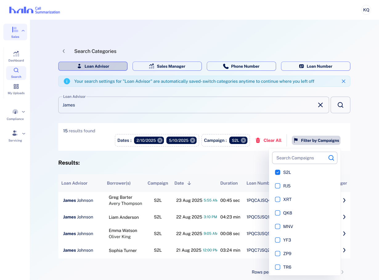
After selecting a category, that section minimizes to a persistent tab bar at the top. The search bar and results appear below, keeping context visible at all times. Keyword matches are highlighted inline within results.
Screen 3 — Date Filter
A date picker with preset options (Today, This Week, This Month) and a dual-month calendar view allows users to narrow results by call date without leaving the search flow.
Screen 4 — Active Filter Chips
Applied filters surface as chips below the search bar, showing total result count and making it easy to modify or remove individual filters at a glance.
Screen 5 — Campaign Filter Dropdown
A dropdown with checkbox-style multi-select enables Sales Managers to filter results by campaign tags — a key workflow for pipeline review.
Screen 6 — Expanded Borrower Results
When searching by Loan Advisor, results expand to show stacked borrower entries with associated Sales Manager and Campaign columns — giving advisors a complete picture of their pipeline in a single view.
TAKEAWAYS
Designing around a technical constraint — rather than against it — produced a cleaner user experience. Forcing category selection upfront became a feature, not a flaw: it reduced cognitive load and made the search interface immediately comprehensible to both Loan Advisors and Sales Managers.
Using Figma Make to explore layout patterns before wireframing saved significant iteration time and surfaced the progressive disclosure approach that became the defining characteristic of this solution. The result: a persistent, stateful search experience that works within the system's architecture while feeling natural to users.